  |
1/360
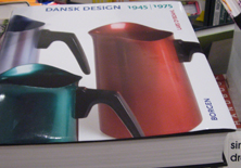
In the design researcher Lars Dybdahl’s book about Dansk Design 1945-1975, he chose and emphasised an example of a book series. This was one of the 360 design-products selected to represent the thirty years of design.
The example chosen was this one: The book title translated from Danish is The class struggle of the farmers in Denmark.
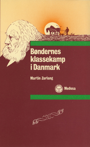
“Among the many new publishers were Medusa, whose profile was generally influenced by the break-up in the critical science of literature at The University of Copenhagen where many of the books originate from innovative, critical theses uncovering the multifarious ideological nooks and corners in the “bourgeois literature”. In a graphically professional manner Bruno Ingemann gave them a common basis in a modest format and in the pleasant typeface Linotype Aldus, just as the serial look was visually enhanced on the covers. Here a square was pushed in from the right and became the zone for the text, and two heavy bars, where the upper one continues on the spine and the backside, demarcating with their saturated colours the text square from the rest of the front cover, where a photo or a drawing created a feeling of the topic. In the middle of the 1970s publications like Medusa’s had an important exemplary function for an aesthetic reinforcement of the work of cover and graphic design among the alternative publishers.”
Quotation from Dybdahl, Lars (2006): Dansk Design 1945-1975, Copenhagen: Borgen.
|
|
|